Basic Cycle Co Creative direction & Identity
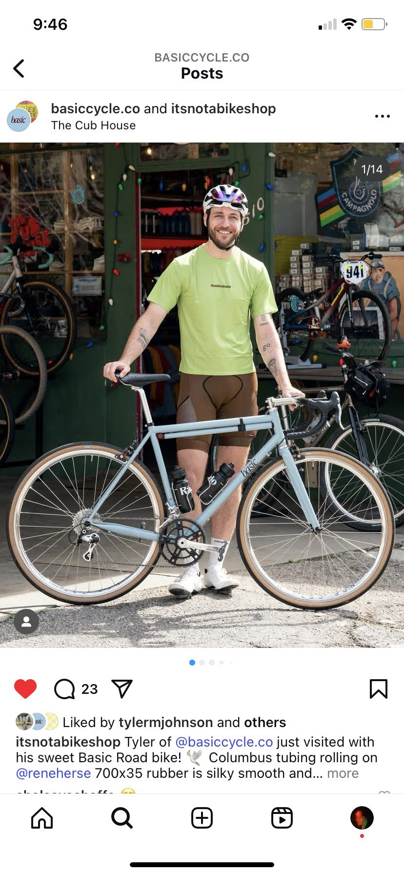
A simple and beautiful road bicycle is difficult to find. Modern options tend to be sporty and likely require a manual, a professional, or a moderate amount of patience to fix and maintain. Additionally, if you want something stylish, you may find yourself in the world of vintage bicycles which, while incredibly classy, don’t possess modern comforts. My husband Tyler Johnson and I founded Basic to strike the perfect balance.
Simplicity is at the core of both the product and the Basic brand itself. When approaching the creative direction, that ethos was foundational. We wanted it to feel timeless and beyond trends, like something that could have existed 20 years ago or could exist 20 years from now. The lowercase lettering in the logo is approachable, tight kerning gives it a retro attitude, and italics add a sense of momentum without becoming overly athletic. The frame colors were chosen to feel classic and coordinated. In fact, the blue is actually a Porsche swatch, Meissen Blue, which dates back over 60 years.
• Creative & art direction • identity • photography • website • merch


Branding process ● We landed on the wordmark very quickly. The italicized serif was friendly and energetic in all the right ways. The head tube logo, however, was much more of a challenge. I began exploring building blocks and simple shapes to illustrate the elemental idea of ‘basic’. Among our favorite concepts was a ‘b’ made with flowing lines that mimicked a road or an abstract cyclist bent over the bike.
Ultimately, they all lacked synergy with the wordmark. So I went back to the beginning, framed the ‘b’ from the wordmark with negative space, and softened the corners. The two logos now work well together and the rectangular shape suits the narrow space of the head tube perfectly.
Keep it basic, baby.